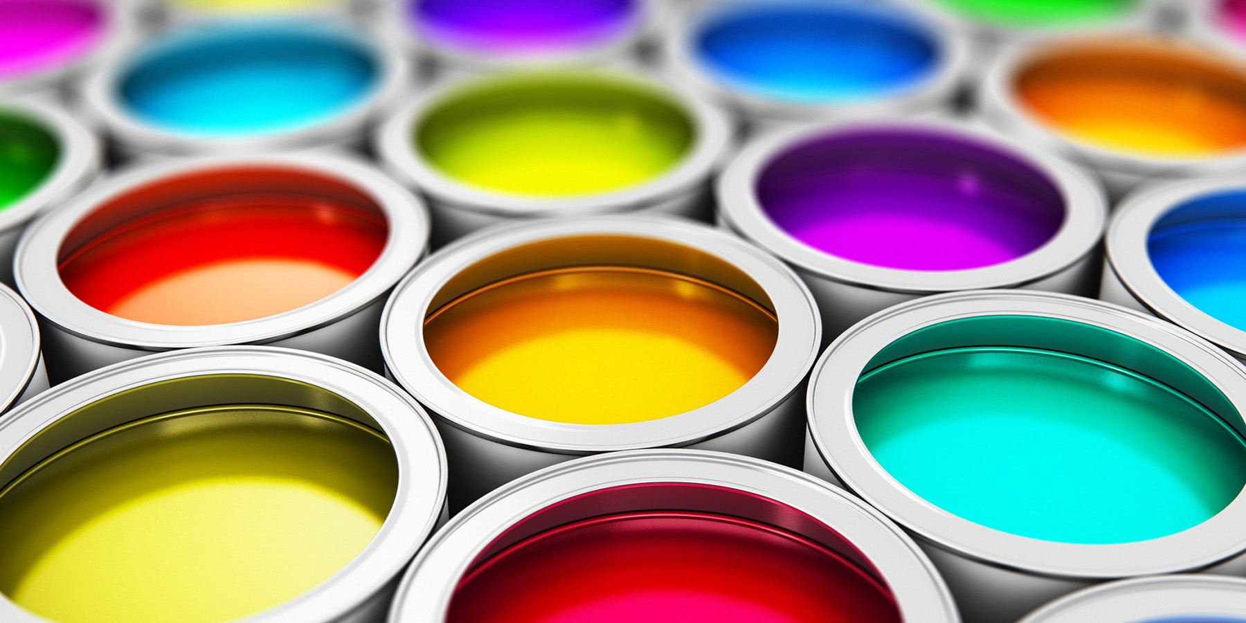
We associate colors with brands. Don’t believe me? Imagine if Home Depot was green and Starbucks was orange. Yuck. It leaves an unsettling feeling because of the color association with the brand itself. If the colors were to change, it would almost seem to change our bodies natural response to the brand we’ve associated with that color.
Cones and Your Cranium
It’s easy to say that we all see color with our eyes, but our eyes aren’t just seeing the color. Our eyes are actually performing two different functions at the same time. The cones are cells in the retina located in the back of our eyes. Their primary function is to send electrochemical signals to a region of the brain called the visual cortex where images are formed. These electrochemical signals also go to a region of the brain called the hypothalamus, which is responsible for producing hormones in our body to regulate body temperature, hunger, sleep, and circadian rhythms. This means that our eyes are not only detecting color from light, but also trigger responses from the brain to release hormones throughout our bodies. For example, when we wake up we are exposed to blue/green light from the sky and the environment. Exposure to that light prompts the release of the hormone cortisol from the brain to the bloodstream, which is a hormone that aids in waking us up. In contrast, at night when the amount of blue light from the sun dissipates, this releases melatonin from the brain to the bloodstream to make us become drowsy. The retinal cells of the eyes and the hypothalamus are sensitive to the short wavelengths of the color spectrum. Essentially, there’s a psychological mechanism in which color and light are able to affect mood, heart rate, impulsive behavior, and alertness.
Selection from Attention
Marketing psychology is complex because consumers can be influenced by numerous factors surrounding color. Every color actually has a prominent influence on consumer behavior, but it’s worth noting that color has a psychological influence on emotion and attitude. Although color prompts this reaction, it depends on how it affects personality, experience, cultural background, and the context of the product.
When choosing a color to market a brand, you are choosing the personality you want to project to your customers. For example, if you’re going for an upbeat and exciting personality, you’d choose the color red. Or if you’re going for a laid back, relaxed personality, you’d choose blue. If you’re going for the perfect combination of both, you would use purple — but we’ll get to that in a second. Ultimately, color is an essential tool because it directs our attention and guides us in decision making based on how the product makes us feel.
Why Do I Buy Coca-Cola?
To be specific, the color red is a vibrant color that is also very polar in the sense that it reflects on our physical needs, but in two contrasting extremes. Red is used to show love and comfort, which gives significance to the color associated with Valentine’s Day. On the other end of the spectrum, red can portray terror, fear, and survival — a common theme in horror movies. In contrast, Red can be a very energizing color that represents friendliness and strength, but can also be demanding and aggressive depending on the context of the image. Red is an intense color that increases heart rate and blood pressure, making you breathe more heavily. So, in a circumstance with exposure to too much red, it can become rather irritating and provoke aggression.
The color red also has an exceptional capability when used in marketing. When it comes to visual cues, red evokes an intense emotional response because it raises your heart rate and creates a sense of urgency. Marketing that uses this color is tailored toward impulsive shoppers and is often utilized for clearance sales because it elicits a sense of urgency. Red also has an effect on appetite, and the sight of it can actually enhance your metabolism as well as stimulate appetite glands. This is why most fast food restaurants such as McDonald’s, Wendy’s, and Chick-fil-A to name a few, utilize red in their buildings, signs, advertising, and merchandise. This elicits an urgent response to hunger. According to The Psychology of Colors in Marketing and Branding, “62%-90% of shoppers make snap judgments based on the influence of this color.” From this statistic, it is commonplace to see red in advertisements for companies like Coca-Cola because red attracts more attention than any other color.
A Ray of Sunshine
The color yellow has the longest wavelength of any color which means that it’s the first color that our eyes see and interpret. In other words, our brains are made to see yellow first, so it’s no wonder that McDonald’s golden arches and the Shell gas station logo are yellow because they’re meant for you to see them right away. In tandem with red, the two colors have an exceptional effect on taste buds and appetite. This is also the reason many companies that are not in the food industry will steer away from using yellow and red together because it has a strong connotation to fast food. The color yellow is most often associated with happiness, creativity, and optimism. This is because it’s also associated with warmth, which is mostly because of the sun. Intriguingly, yellow is the only primary color that doesn’t have muted tones, therefore it’s inevitable to stand out. Yellow is extensively used in toys for babies because their eyes see and learn to interpret yellow first — therefore they are more often than not able to show a reaction when exposed to toys with a yellow shade. In addition, with yellow being the most visible color, it’s especially helpful for store owners to advertise this color on products in front of their stores. This is very appealing to window shoppers and is a mechanism to draw customers into their stores. It is not only a striking, visible color, but it represents caution and safety, so customers are likely to feel they are making a safe purchase. Overall, Yellow brings energy and cheerfulness to any brand logo.
The Perfect Blend
Purple is the color associated with wealth and luxury and was historically associated with nobility and royalty. Purple is the color for many cosmetic products because it beams sophistication and high quality — which is easily attractive to those who want to feel and look classy. Also, it enhances our sense of beauty and our reactions to creative ideas, further explaining its association with cosmetics. Following its association to sophistication, using purple when marketing services can indicate high-quality services, such as companies like FedEx. The 18- to 25-year-old market is especially attracted to this color because they interpret it as sexy and rebellious, but on the contrary, innovative designers connect this color with elegance and power.
Purple has also been found to be more suitable for products pertaining to women and children. Specifically, the lavender shade of purple is found to be more appealing when marketing products such as antique goods or sentimental crafts because it suggests nostalgia. Purple is also an indicator of imagination, wisdom, and creativity which is also why it’s used in brands such as Hallmark and Yahoo. It is described as the “perfect blend between the stability of blue and the energy and power of red.”
Color Affects Consumer Behavior
In summation, color is the reason many consumers decide to buy products. With science supporting it, there’s no reason that marketers shouldn’t take advantage of the natural chemistry of color and consumer behavior.
If you found this compelling, scent also has a profound influence on consumer behavior — check out our blog: The Science of Scent-Based Marketing.